The “Nano Banana” Effect: How to Turn YouTube Videos into Info-graphic
🏁 Bottom Line Up Front
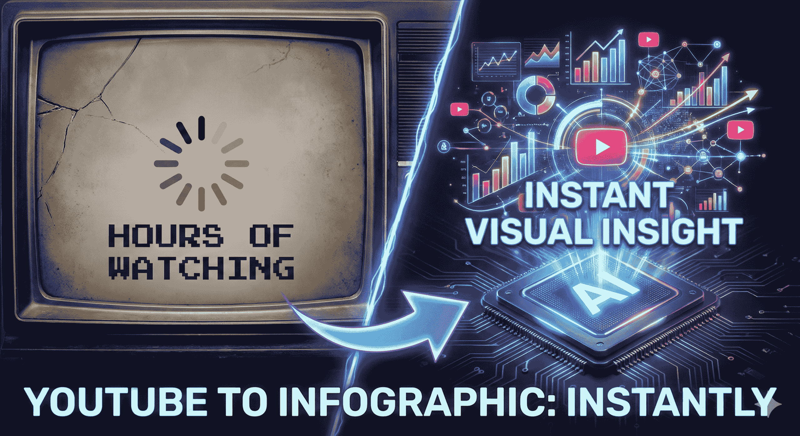
The Problem: We are drowning in video content. The average professional wastes hours every week re-watching videos to find specific data points, and retention drops to less than 40% just one hour after watching.
The Solution: The “Nano Banana Pro” Workflow. By leveraging Google Gemini’s multimodal capabilities, you can instantly convert any public YouTube URL into a high-fidelity infographic.
The Result: This workflow reduces content digestion time by 90%, boosts learning retention significantly, and allows creators to repurpose one video into multiple visual assets instantly.
The Future: Visual AI summarization is no longer just a cool trick; it is a critical productivity skill for 2025.
🔑 Key Takeaways
- Speed: Digest a 1-hour lecture or market update in under 60 seconds.
- Retention: Visual infographics increase information recall by up to 65% compared to text notes.
- Simplicity: No complex coding required—just a YouTube link and the right Gemini prompt.
- Versatility: Perfect for students (study guides), marketers (social posts), and executives (reports).
- Cost: Uses tools you likely already have (Google Gemini).
📉 The Death of Video Overload
Let’s be honest: your “Watch Later” playlist is where videos go to die.
We live in the golden age of video content. Whether you are a student trying to cram for finals, a marketer researching competitors, or a business owner keeping up with industry trends, the volume of information is overwhelming.
The traditional way of consuming this content is broken:
- It’s Slow: Even at 2x speed, a 20-minute video takes 10 minutes to watch.
- It’s Linearly Trapped: You can’t “scan” a video like you can a blog post.
- It’s Hard to Reference: Finding that one specific statistic mentioned at 14:02 is a nightmare.
This is where the Nano Banana Pro Workflow changes everything. It doesn’t just summarize; it visualizes.
🍌 What is the “Nano Banana Pro” Workflow?
“Nano Banana Pro” is the community term for a specific, high-speed workflow using Google Gemini’s Advanced Multimodal Models.
Why the name?
- Nano: Refers to the speed and efficiency of the AI model (processing vast data in seconds).
- Banana: A playful metaphor for making the content “appealing,” digestible, and easy to consume—peeling away the fluff to get to the fruit.
Unlike older tools that merely transcribed audio into a wall of text, this workflow uses Gemini’s ability to “watch” the video frames and understand the context. It then structures that data and can even generate the visual code or image description to create a professional infographic.
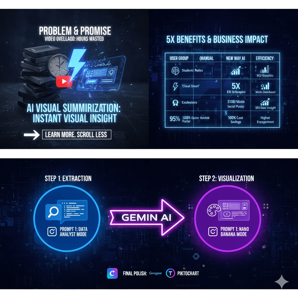
💼 The Business Impact Matrix
How much time could you save? Let’s look at the numbers.
| User Group | The Old Way (Manual) | The “Nano Banana” Way (AI) | Efficiency Gain |
|---|---|---|---|
| Students | Watch 1hr lecture, pause, write notes manually. | Paste URL, generate visual “Cheat Sheet” in 30s. | ⚡ 95% Faster |
| Marketers | Pay a designer $100+ and wait 3 days for one graphic. | Generate 5 infographic variations instantly for social media. | 💰 100% Cost Savings |
| Executives | Watch 30 min market update video for key stats. | Review a 1-page visual dashboard in 2 mins. | 🧠 15x Faster Insight |
| Creators | Edit video clips for hours to make shorts. | Turn a video hook into a viral Instagram carousel. | 📈 Higher Engagement |
🌟 5 Major Benefits of AI Visual Summarization
Why should you adopt this workflow today?
1. Radical Time Efficiency ⏱️
AI can process and summarize content much faster than a human ever could. You are essentially “downloading” the video’s knowledge into your brain without the time cost of watching it.
2. Enhanced Learning & Retention 🧠
We are visual creatures. Studies show that people follow instructions 323% better with text and illustrations than without. The Nano Banana workflow forces the AI to present data visually, ensuring you actually remember what you learned.
3. Content Curation on Autopilot 🤖
Imagine dropping 10 videos into the AI and asking, “Which of these discusses AI regulation?” The workflow helps you curate relevant information from large volumes of data instantly, allowing you to ignore the noise and focus on the signal.
4. Multilingual Capabilities 🌍
The internet is global, but your language skills might not be. This workflow works across languages. You can feed it a video in Japanese and ask for an infographic summary in English.
5. Accessibility for All 🤝
For individuals who face challenges with auditory processing or simply prefer reading, this tool democratizes access to information. It turns fleeting video/audio into permanent, accessible visual records.
🎯 Who Needs This Technology Right Now?
This isn’t just for tech geeks. It is a fundamental tool for:
- Students: Turning confusing lectures into clear study maps.
- Content Creators: Repurposing one YouTube video into a week’s worth of Tweets and LinkedIn posts.
- Business Professionals: Synthesizing industry reports for team meetings.
- Researchers: Distilling hours of interviews into clear data points.
🛑 Conclusion of Part 1
The era of passively watching hours of video is over. With the Nano Banana Pro Workflow, you are no longer just a consumer of content; you are a master of it.
You now understand the strategy and the massive ROI of visual summarization. But how do you actually do it? Which buttons do you click? What are the magic prompts?
Coming up in Part 2: We open the hood. I will give you the exact Copy/Paste Prompts, the step-by-step guide, and the troubleshooting tips to build your first infographic in the next 5 minutes.
Step-by-Step Guide: Master the “Nano Banana Pro” Workflow
🏁 Introduction
In Part 1, we explored the “why”—how the Nano Banana Pro Workflow solves the crisis of video overload by turning hours of content into instant visual insights. You saw the potential for saving time and boosting retention.
Now, it’s time for the “how.”
This isn’t a theoretical concept. This is a practical, hands-on guide. By following the steps below, you will have your first high-fidelity infographic generated in minutes. We’ll walk through the tools you need, the exact copy/paste prompts to use, and how to polish your final result.
Let’s open up the power of Gemini.
🛠️ The Prerequisites: What You Need Before Starting
You don’t need expensive software or a design degree. You just need:
- Google Gemini Account: For the best results, including the fastest processing and highest quality image generation, a Gemini Advanced account is recommended. The free version can handle the text summary, but may struggle with the complex visual generation.
- A Target YouTube Video URL: Find a public video you want to summarize. Educational content, tutorials, webinars, and market updates work best. (No transcript file needed—Gemini will handle it).
- The “Nano Banana” Prompts: The specific instruction scripts provided below.
🍌 The 2-Step “Nano Banana” Protocol
This is the secret sauce. Most people fail because they ask Gemini to do everything in one giant, confusing prompt.
The key to success is separating the “Brain” from the “Hand.”
- Step 1 (The Brain): We extract the raw data logically.
- Step 2 (The Hand): We visualize that data artistically.
Step 1: The “Deep Extraction” Phase (The Brain)
First, we need to force Gemini to watch the video and organize its thoughts. Do not ask for an image yet. We want pure, structured data.
📝 Copy/Paste Prompt 1:
“Act as a Senior Data Analyst. Watch this YouTube video: [INSERT VIDEO LINK HERE].
I need a structured data summary to prepare for an infographic. Please extract and organize the following:
- The 3 Main Pillars or Core Arguments of the video.
- 6 Key Statistics or Hard Data points (include specific numbers, dates, or percentages).
- 3 Powerful Quotes that sum up the creator’s message.
- A brief, step-by-step logical flow of the content.
Output format: A clean, hierarchical bulleted list. Do not generate an image yet. Just give me the raw data.”
Hit enter and wait for Gemini to generate the text summary.
Step 2: The “Visualization” Phase (The Hand)
Now that Gemini has the data in its context window, it’s time to turn it into a visual asset. This is where the “Nano Banana” (appealing visual) magic happens.
We will instruct it to use its internal image generation model to create the infographic based only on the data it just extracted.
📝 Copy/Paste Prompt 2:
“Excellent. Now, using only the data you just extracted above, generate a high-fidelity, professional infographic image.
Technical Constraints:
- Model Logic: Use the advanced ‘Thinking’ model capabilities for perfect text rendering within the image.
- Aspect Ratio: 16:9 (Wide format for presentations/desktop).
- Text Rules: Ensure all headlines are big and bold. Keep body text concise and legible. Ensure zero spelling errors.
Visual Style: [PASTE ONE STYLE OPTION FROM BELOW]“
🎨 Choose Your Visual Style
Paste one of these into the prompt above to define the look.
- Option A: The “Corporate Boardroom” (Best for Business/LinkedIn)
"Style: Swiss Design aesthetic. Minimalist. Grid-based layout. Use a professional color palette of deep navy blue, charcoal, and clean white. Use clean sans-serif typography. High contrast."
- Option B: The “Napkin Sketch” (Best for Concepts/Education)
"Style: Hand-drawn whiteboard aesthetic. Marker texture. Use arrows, circles, and doodles to connect ideas. Casual, handwritten font style. White background with black and red ink lines."
- Option C: The “Cyberpunk HUD” (Best for Tech/Crypto)
"Style: Futuristic User Interface (FUI). Glowing neon blue and purple lines on a dark, circuit-board background. Data visualization style with holographic elements."
🚀 Advanced Tips & Polish
The AI output is incredible, but it’s usually 90% of the way there. Here is how power users get that final 10%.
1. The “Canva Hybrid” Method
Sometimes, even the best AI model will make a small spelling error or align a box incorrectly.
- The Fix: Use the AI-generated image as a wireframe. Import it into a tool like Canva or Venngage, trace over the layout with their perfect text tools, and use it as the foundation for a flawless final design.
2. The “Competitor Spy” Strategy
Don’t just use this for your own learning. Take a competitor’s top-performing YouTube video, run the Nano Banana workflow, and instantly visualize their entire content strategy in one image.
3. The “Viral Repurpose” Workflow
Are you a creator? Take your best-performing long-form video. Run the workflow to extract the top 5 stats. Then, create a 5-slide Instagram Carousel, with one stat per slide. You just turned one video into a week’s worth of social content.
🛑 Conclusion & Challenge
The Nano Banana Pro workflow is more than just a cool AI trick; it is a fundamental shift in how we process information. It turns the passive act of watching into the active act of visualizing.
Your Challenge: Right now, go to your YouTube “Watch Later” playlist. Pick the most intimidating, long video you’ve been putting off. Run it through the 2-step protocol above.
See how quickly you can turn confusion into clarity.
🔗 Relevant External Links
- HubSpot & Venngage Report: Citing data on visual content effectiveness.
- Google Gemini Blog: For official updates on multimodal models.
- Venngage Data Design Guide: For best practices in information design.
🏠 Relevant Internal Links to intel4ai.com
- Home/Tools:
- Blog Section: i Made an Web App from this blog example
📺 YouTube Video Embed
- Recommended Video: A tutorial demonstrating Gemini’s image capabilities.
- Watch this video for a deeper dive into Gemini’s latest visual features.
❓ Frequently Asked Questions (FAQ)
Q1: Can Gemini watch YouTube videos directly?
A: Yes. Gemini’s multimodal capabilities allow it to process a public YouTube URL, analyzing both the visual frames and the audio transcript to understand the content contextually without needing a separate text file.
Q2: Is the Nano Banana Pro workflow free?
A: The core workflow uses Google Gemini. While there is a free tier that can summarize text effectively, the high-fidelity image generation required for professional infographics usually yields better results on the paid Gemini Advanced plan.
Q3: How accurate are the AI-generated infographics?
A: They are highly accurate for summarizing main themes and structures. However, AI can sometimes “hallucinate” specific numbers or spellings. It is always recommended to verify critical data points against the original video source.
Q4: Can I use this for videos in other languages?
A: Absolutely. One of Gemini’s strengths is translation. You can input a video URL in Spanish, French, or Japanese and ask the prompt to generate the infographic summary in English.
Q5: What is the best alternative if I don’t want to use Gemini?
A: If you prefer more structured, non-visual notes, tools like Mapify or Lilys.ai offer dedicated “video-to-mind-map” or summary features. For manual infographic design, Canva and Piktochart are excellent choices.
Q6: Why is it called “Nano Banana“?
A: It is a playful community term. “Nano” refers to the speed and efficiency of the AI model, and “Banana” is a metaphor for making complex content “appealing” and easy to digest, like peeling a fruit.
👋 A Quick Thanks
Thanks for reading! I hope this guide helps you reclaim your time and turn the noise of endless video content into clear, actionable visual signals. If you try the Nano Banana workflow, I’d love to see what you create—drop a comment or tag us so we can see your first AI infographic!
Keep learning,
The Intel4AI Team
Article Word Cloud image
Affiliate Disclosure:
- Disclosure: This post may or may not contain affiliate links. This means I may earn a commission or other value if you make a purchase through these links. Rest assured, this comes at no extra cost to you and helps support the content creation process. Thank you for your support!
If some one needs expert view about blogging afterward i recommend him/her to pay
a visit this web site, Keep up the nice work.
Thank you for the kind recommendation 😄 — I really appreciate it. I’m glad you found the content useful. I’ll definitely keep working to provide helpful and high-quality articles. Thanks again for the support!